

Overview
The H&H Website was one of my personally proposed projects when I first started working at the company. They originally had an outdated website with little functionality and visual appeal. These were the two guiding factors to first creating the website.

Layout
The layout of the website is based on a single scrolling page, helping keep all the important content that the viewers need to see in easy reach. Smaller sub-pages are dotted throughout the site for a more detailed read. The important information at the bottom, such as location and contacts, which makes the viewer scroll through the ink type examples further promoting the business

Presentation
Color and Shape are important factors. I designed the majority of the background to be dark, because many people tend to prefer a darker theme online, and tends to be easier to view on a screen. Other small touches like smooth scroll, fade in, and red scroll over highlighting help make the site feel more complete and active for the viewing experience.
Multi-Use
It was later requested that the site have a location for the employee handbook. This was one of the first hidden pages, that also requires a password to unlock, so the general public doesn't have easy access to company documents. The extra page also doubles as an announcement board for employees who are absent from work or for off hour messages.

Functionality
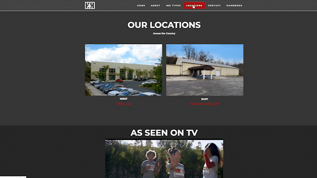
The site also offers a multitude of functionality options, such as Google Maps redirects when clicking on the locations, playable videos, working email addresses, expandable image galleries and more. It is also compatible on mobile devices for easy use no matter where the viewer is located.
Final Product
Overall, the final website design has been a great improvement over the company's original website. It has had a very positive impact on the image of the company and has helped to bring in multiple new customers for the business.
