

Overview
My personal logo has gone through many stages. It has taken multiple years of re-designing and tweaking. The logo itself is intended to be a minimalistic, modern style I tend to design with. Being that it is simple and only two shapes, it can be conformed to many themes and styles by simply changing colors and textures. The overarching these is based around my initials C and S.
Origins
My logo was originally created in a college class. We were tasked to create a logo based on text, shape and a mixture of both. I ultimately decided on the mixed design because I felt it clearly represented myself and my brand as a designer


The Transformation
The main changes made from version 1 to version 2:
- Made the S more symmetrical, balancing each side above and below the horizontal
- Changed the middle of the S to be horizontal rather than angled
- Corrected the angle between the cross of the S and the bottom edge of the C
- Rounded the outer edges for a more contemporary look
- Removed the outer lettering to declutter the space
- Wider gap between C and S
Other Defining factors for the new logo:
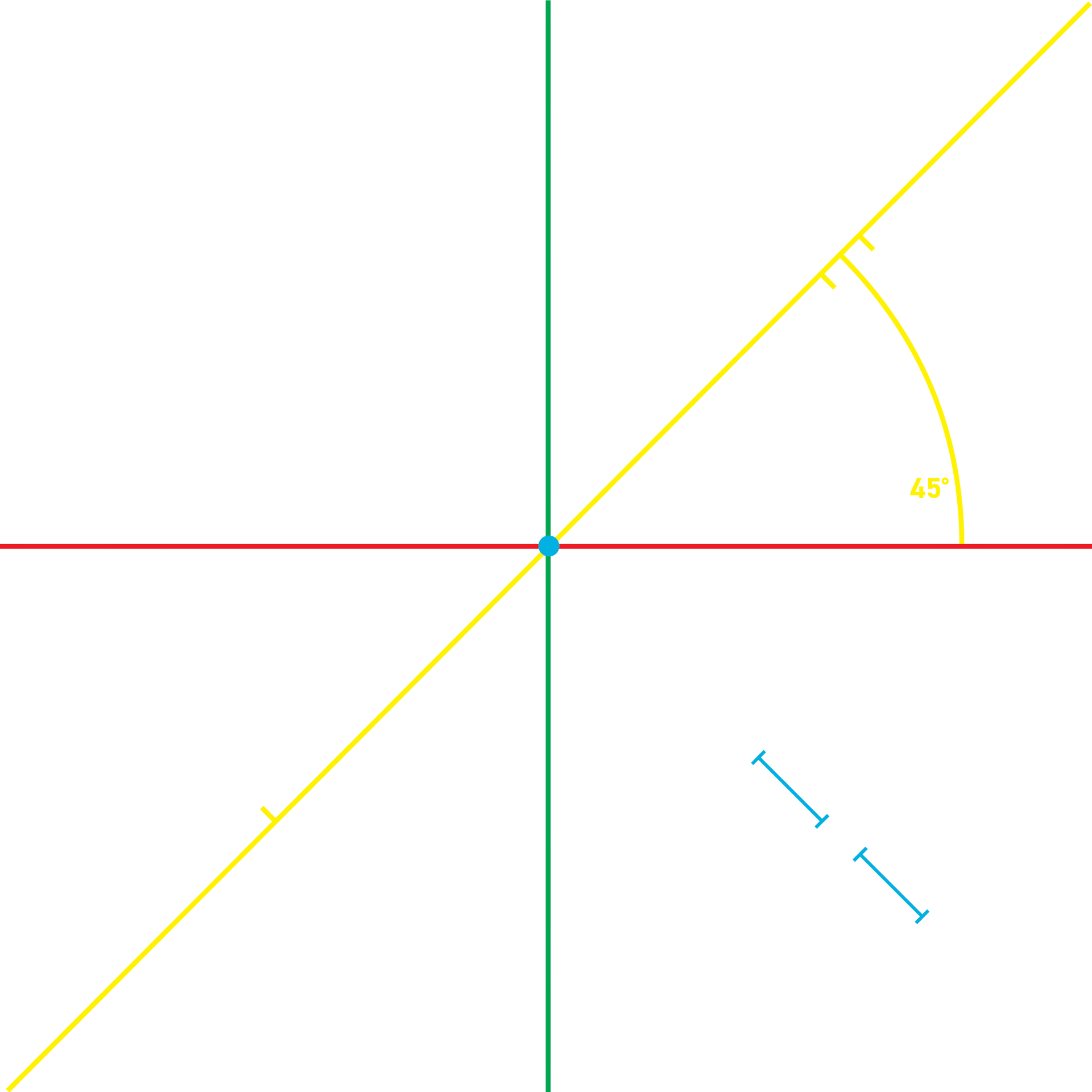
- Balancing weight equally across the X and Y axis
- 45 degree angle for all of the openings of the C and S
- Balancing weight equally across the X and Y axis
- 45 degree angle for all of the openings of the C and S