Overview
The H&H Screening and Graphics T-shirt project came about when the owner of the company was approaching the 36th birthday of his company. I jumped at the opportunity, diving head first into developing multiple designs to present, both for the front, back and sleeve of the design.
The listed requirements for the shirt design included:
- A front and back including the logo of the company
- A printing press arm/support
- Something signifying the age of the company
Extra features that were added to the project:
- American Flag sleeve print
- Extra colors (originally just white)
The listed requirements for the shirt design included:
- A front and back including the logo of the company
- A printing press arm/support
- Something signifying the age of the company
Extra features that were added to the project:
- American Flag sleeve print
- Extra colors (originally just white)


Concept 1
The first concept was designed after a small photoshoot for the website of the company, when looking down from above at one of the printing presses. As shown in the images above, I incorporated both the arms and palates respectively into the design and played around with the location of the arms to offer a wider range of options. This design was based on a more mechanical and technical look.
Concept 2
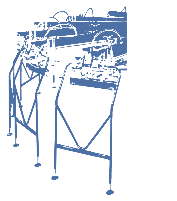
The second concept was aimed to be more realistic in presentation and perspective, but to keep a somewhat painted style by removing too many sharp edges and straight lines. The logo was rotated sideways to cut off the whole machine and allow for a more concise, profile-type view of the machinery. There were multiple color variations created after the owner acknowledged interest in adding more colors to the back design.


Concept 3
The final concept was made to be modern and minimalistic. Many variations were created, due to its simplicity, to allow for flexibility by the owner on what exactly he wanted to present. The main design focus the support for the arm of the printing press, similar to the one in Concept 2

Front Logo
The front logo was based around the lettermark version of the whole company logo. This includes the significance of the company's age by listing its founding year. Location was a priority on the front print which can be seen in the image below accounting for each warehouse location and its corresponding founding year.
Multiple iterations of this design were created to find the most balanced option for a small pocket print. The overlap of the year and logo allow for a sense of depth and connection between two contrasting type faces. The far right design was not chosen due to its tall profile, while the first was too simple.

Final Result
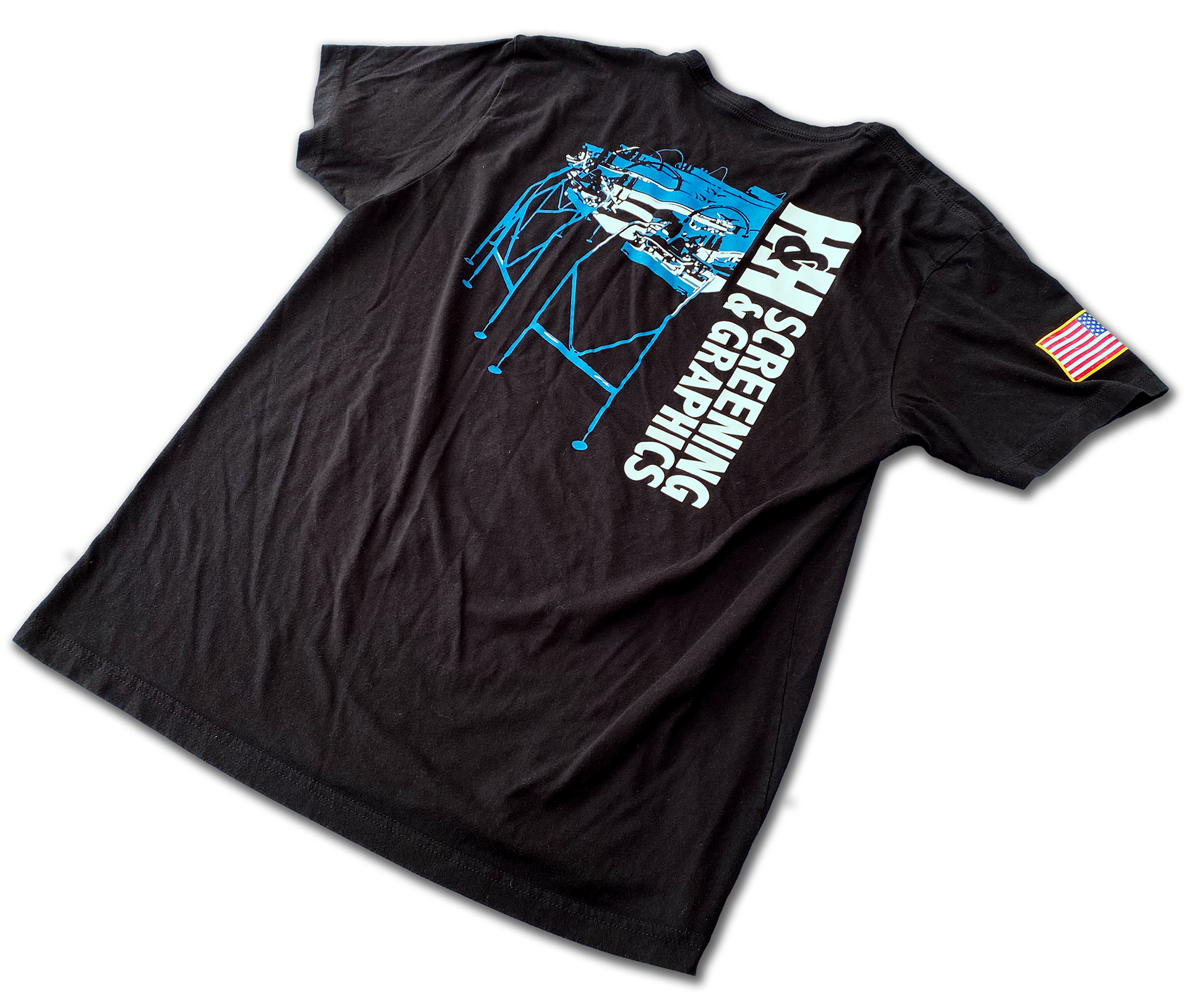
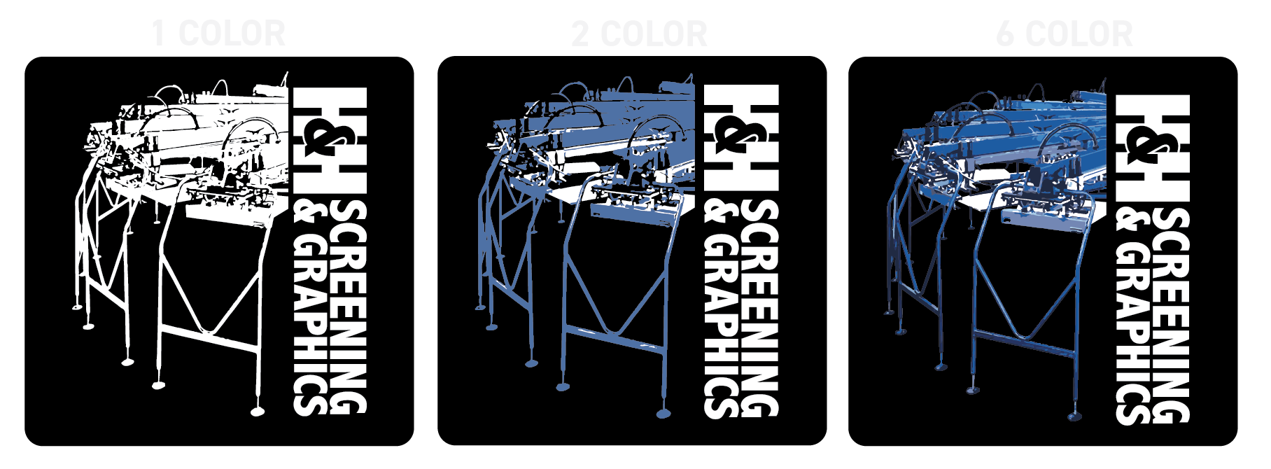
The 2nd concept, two color option was ultimately chosen for a few reasons. It by far best illustrated the the printing press which was one of the main objectives. It also allowed for more color unlike concepts 1 and 3. It was overall the most collected and encompassing option between the three presented concepts.
The limit of two colors allows for a cheaper and less risky print, but removes some of the detail. Due to this, I effectively used negative space to convey more shapes and colors, which can clearly be seen by the tubes protruding out of the top of each arm of the printing press.
There were a total of 168 T-shirts printed with this design on the front, back and sleeve.