

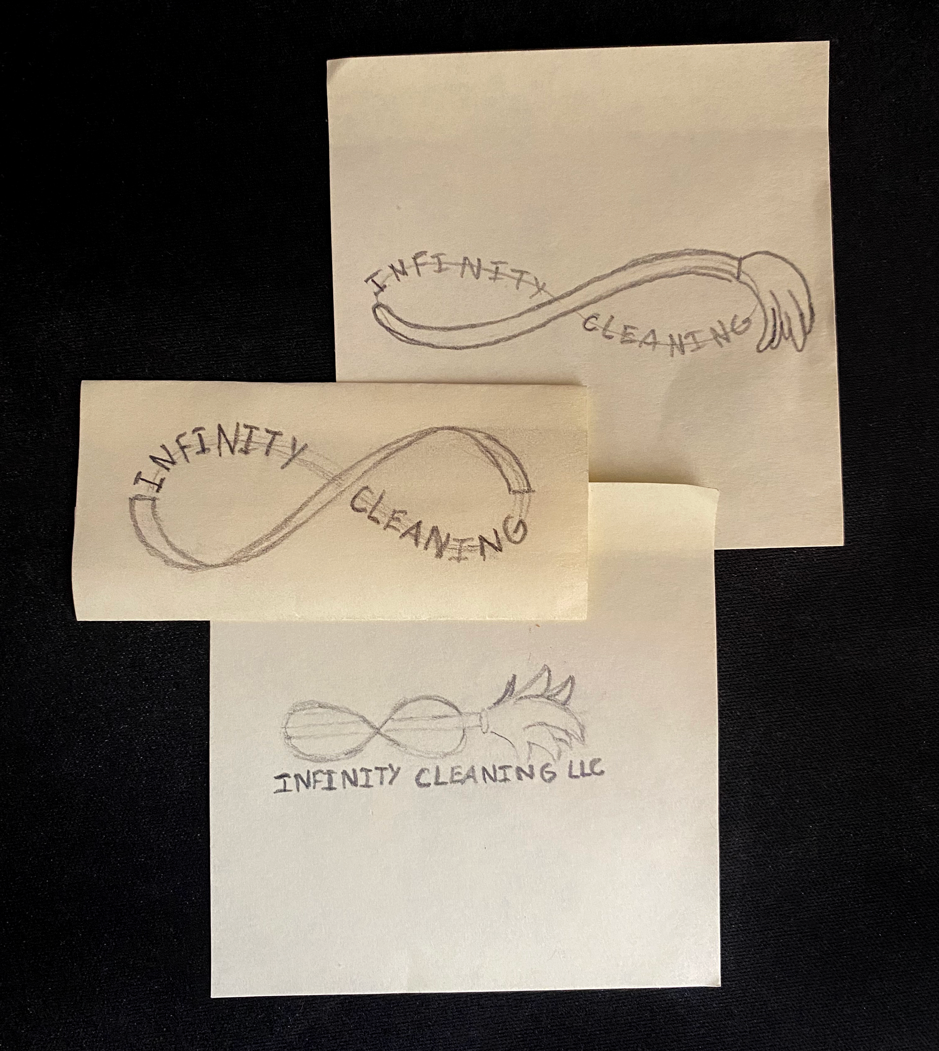
Concepts
The logo for Infinity Cleaning was commissioned by a new small cleaning company. After receiving this job from a mutual friend, the brainstorming process began with scribbling some sketches shown in this figure
Processes
Multiple iterations of the Infinity Cleaning logo were created, with the main focus being the infinity sign and pastel-chrome effect blending across the whole logo. This effect was originally created with multiple overlapping gradients, but later switched to a freeform gradient to give more of an irregular chrome-like texture.


Final Product
The Infinity Cleaning logo presents a professional appearance while effectively communicating the fact that it is a cleaning company by use of the mop incorporated into the "infinity" symbol design. The mop head helps draw the viewer's gaze in to the beginning of the company name, which in turn leads your eyes across the remainder of the logo. The end product is informative, eye-catching, and pleasant to look at due to the flowing pastel-chrome effect that blends the whole logo together.